COLOR
HARMONY-
Color is like the words
of a language. It only makes sense, or nonsense, when used
together. We seldom use color in isolation but with many
other colors around it, harmoniously. In visual experiences,
harmony is something that is pleasing to the eye. It engages
the viewer and it creates an inner sense of order, a balance
in the optical nerve. When something is not harmonious,
it's either boring or chaotic. The human brain will reject
under-stimulating information and also rejects what it
can not organize or understand. Color harmony must present
a logical structure with a sense of order to deliver visual
interest.
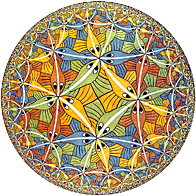
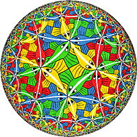
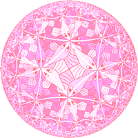
The three primary colors are Red,
Yellow and Blue, which then are blended to create all other
colors. Hues are grouped into various color combinations
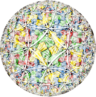
based on their position on a Color Wheel. M.C. Eshcer's classic, "Circle Limit III",
is the source of this demonstration of popular hue and texture manipulations. |